911Switch
Enabling clearer visibility and rapid emergency assistance.
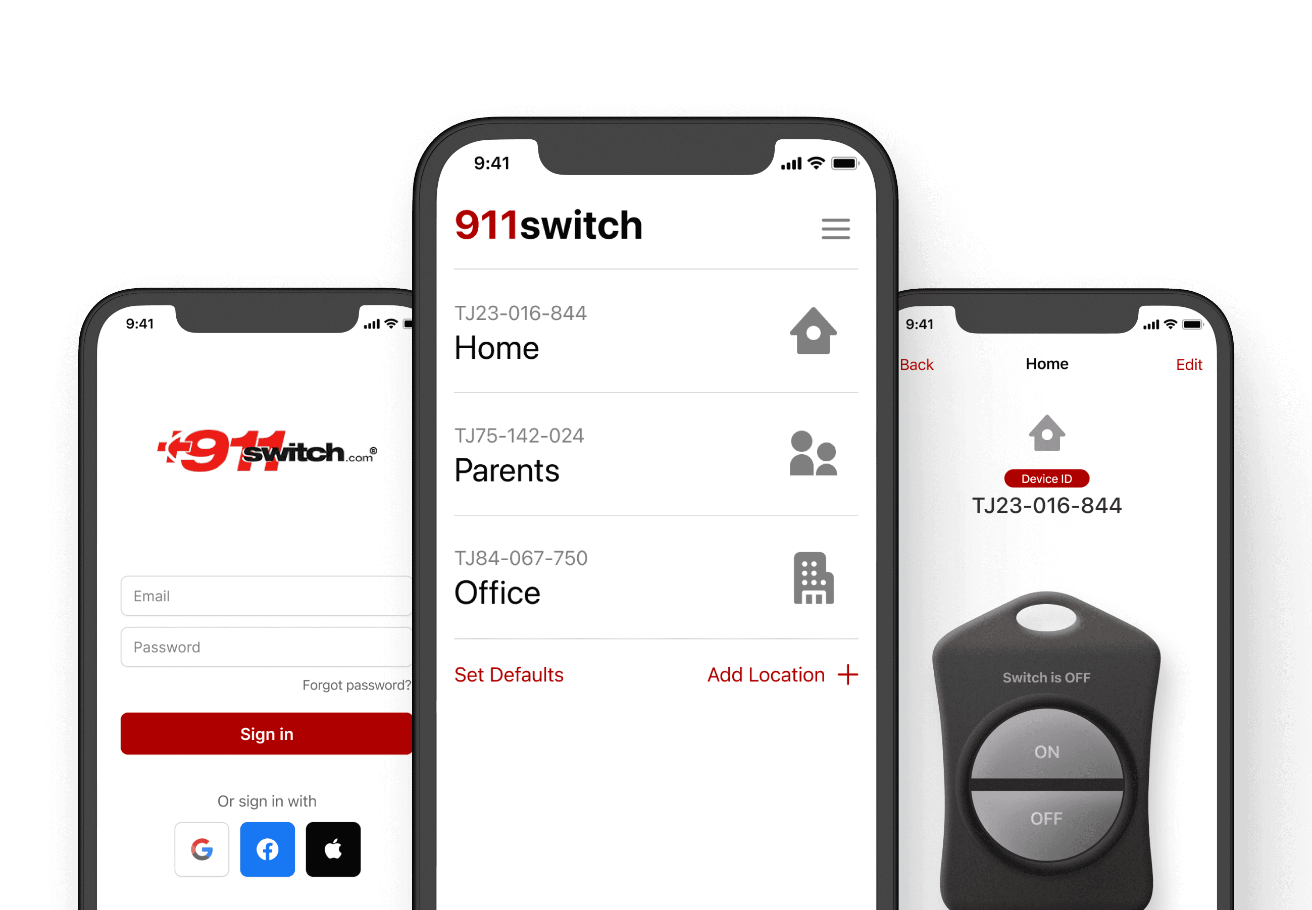
An emergency app experience redesigned for clarity under stress: minimal steps, high contrast, and confidence for the seniors who rely on it.
Services
- UX Research
- UX/UI Redesign
- Interaction Design
- Visual Design
- Design Exploration & Prototyping
Deliverables
- 911Switch Mobile App Redesign
Domain
- Consumer Technology
Brief
Where this started
911Switch is an emergency-response product ecosystem designed to help first responders quickly identify the location of a distress call. When a user triggers an SOS through the 911Switch App, the attached exterior home lighting turns into a flashing beacon, helping responders locate the site instantly.
The product suite includes the 911Switch device, Remote FOB, Hub, and mobile app. The goal was to redesign the existing mobile experience to make it more intuitive, accessible, and senior-friendly while maintaining the existing flow structure.
Challenge
Serious product, unserious interface
Understanding the complete 911Switch ecosystem was initially challenging. While the website offered substantial information, the mobile app lacked clarity, modern design direction, and visual hierarchy. The existing UI appeared outdated and was confusing for its primary user base: senior citizens and individuals living alone.
The goal was to redesign the interface without altering the user flow, ensuring accessibility, clarity, and seriousness appropriate for an emergency product.
Discovery
Four products, one ecosystem
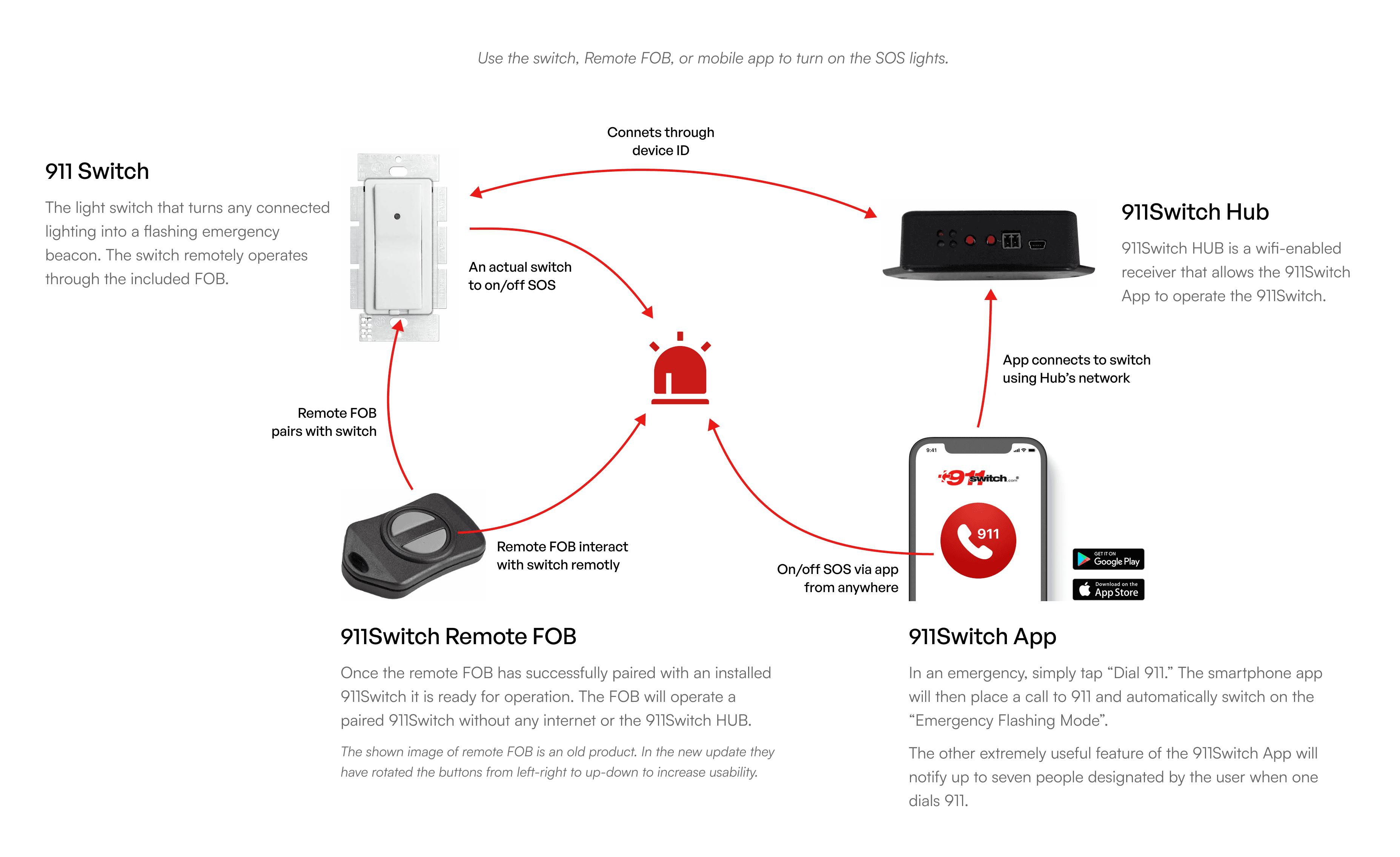
Based on documentation and client input, 911Switch consists of four interconnected products:
- 911Switch physical device
- 911Switch Remote FOB
- 911Switch Hub
- 911Switch Mobile App
How they interact:
- Remote FOB pairs with the physical switch
- App connects to the switch via the Hub
- Users can trigger SOS remotely via FOB or App
- Device communicates using unique device IDs
Key insights from client discussions
The client wanted a simple, clean, and professional interface. Existing app looked outdated and childish. User flow works well and should remain unchanged. Improved icons, accessible typography, and better use of color were top priorities.
Target users
Individuals living alone, primarily senior citizens, and users needing a no-confusion, minimal steps, high clarity interface.
Approach
Designed for the worst minute
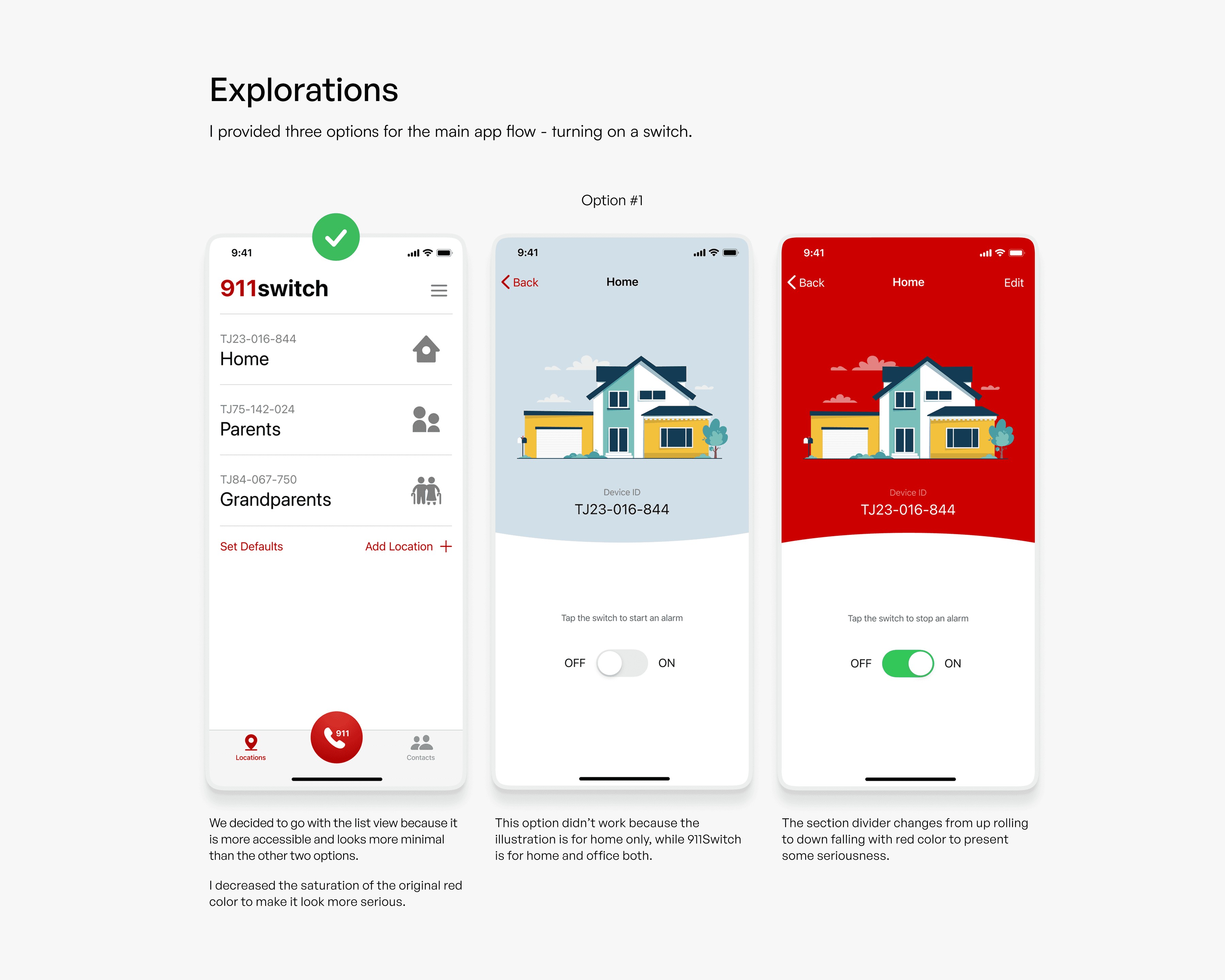
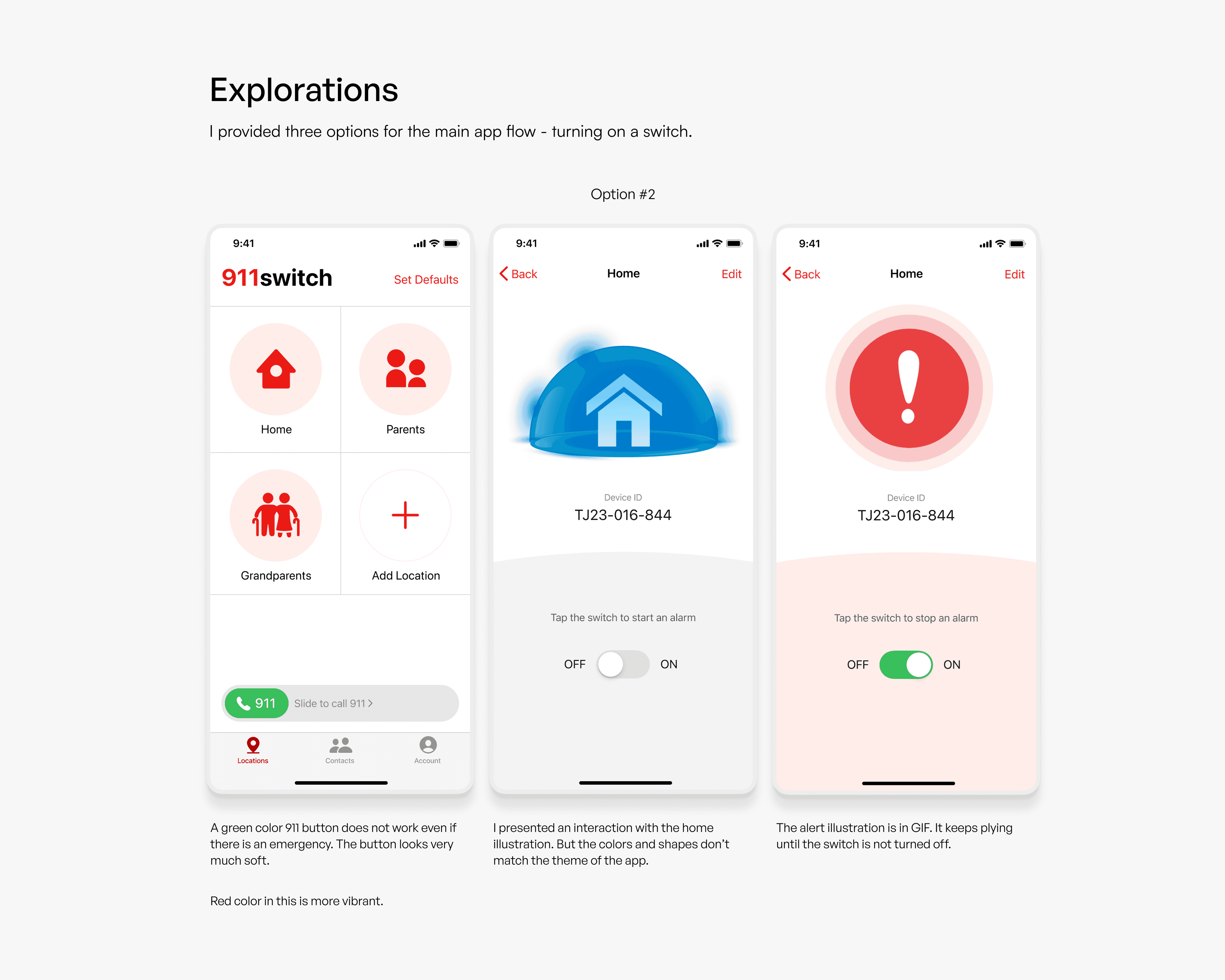
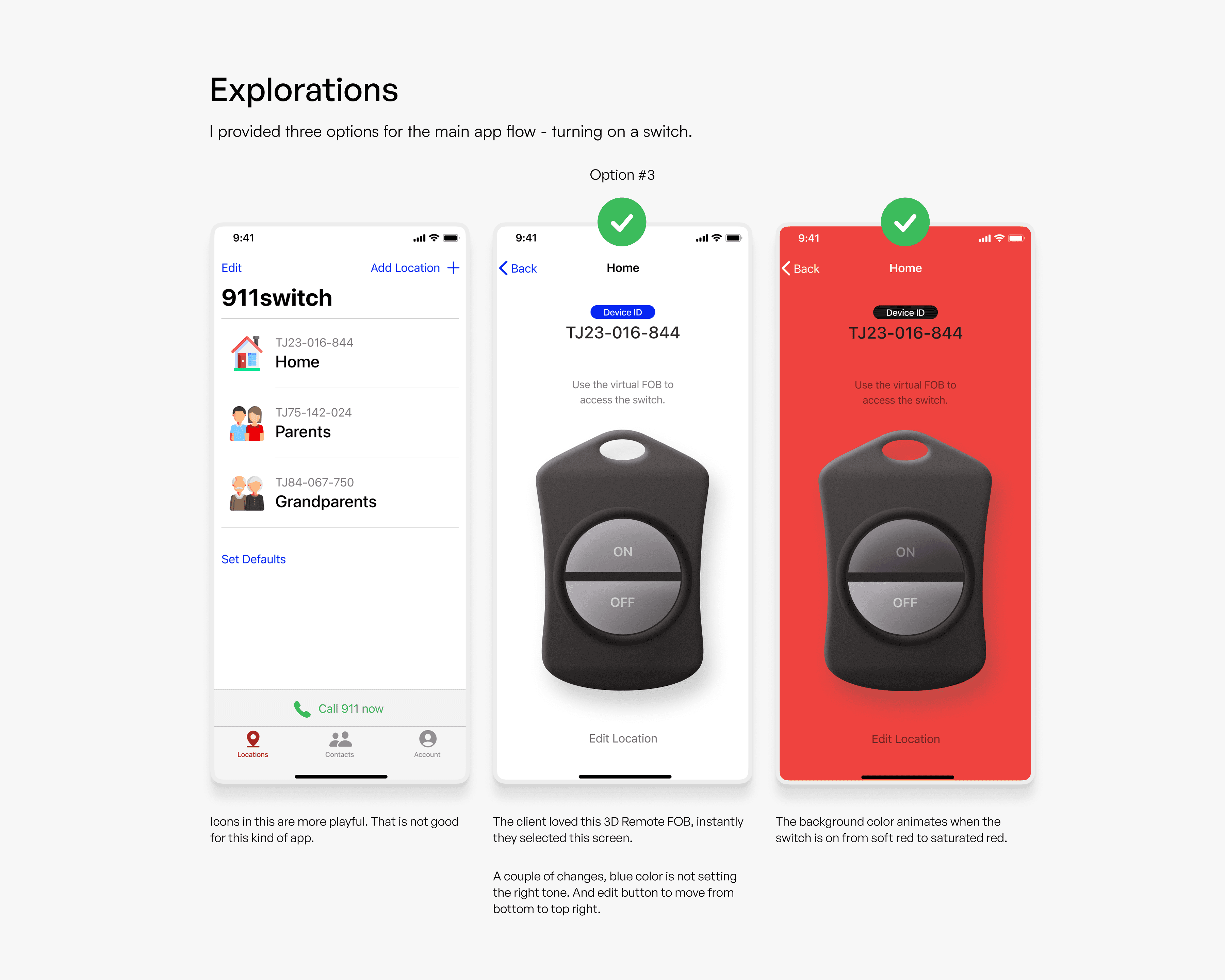
The design process began by mapping the product interactions and reviewing real usage scenarios. Low-fidelity options were created to explore different visual directions for the main SOS flow. Feedback cycles with the client helped validate the final direction.
We focused on making the experience:
Simple
Clear icons, readable labels, and minimal cognitive load.
Consistent
Unified visual language across screens and states.
Reliable
Emergency states clearly communicated through color, animation, and layout.
1 / 3
Design
Effortless under stress
Our objective for the interface was straightforward: make it effortless to use in high-stress situations, even for users who may not be tech-savvy.
We started with an audit of the existing UI and found a few immediate areas of improvement: mixed icon usage, unclear terminology, too many taps for critical actions, and a visual hierarchy that did not guide attention effectively. Instead of reinventing the platform, we focused on simplifying interaction, improving clarity, and strengthening user confidence.
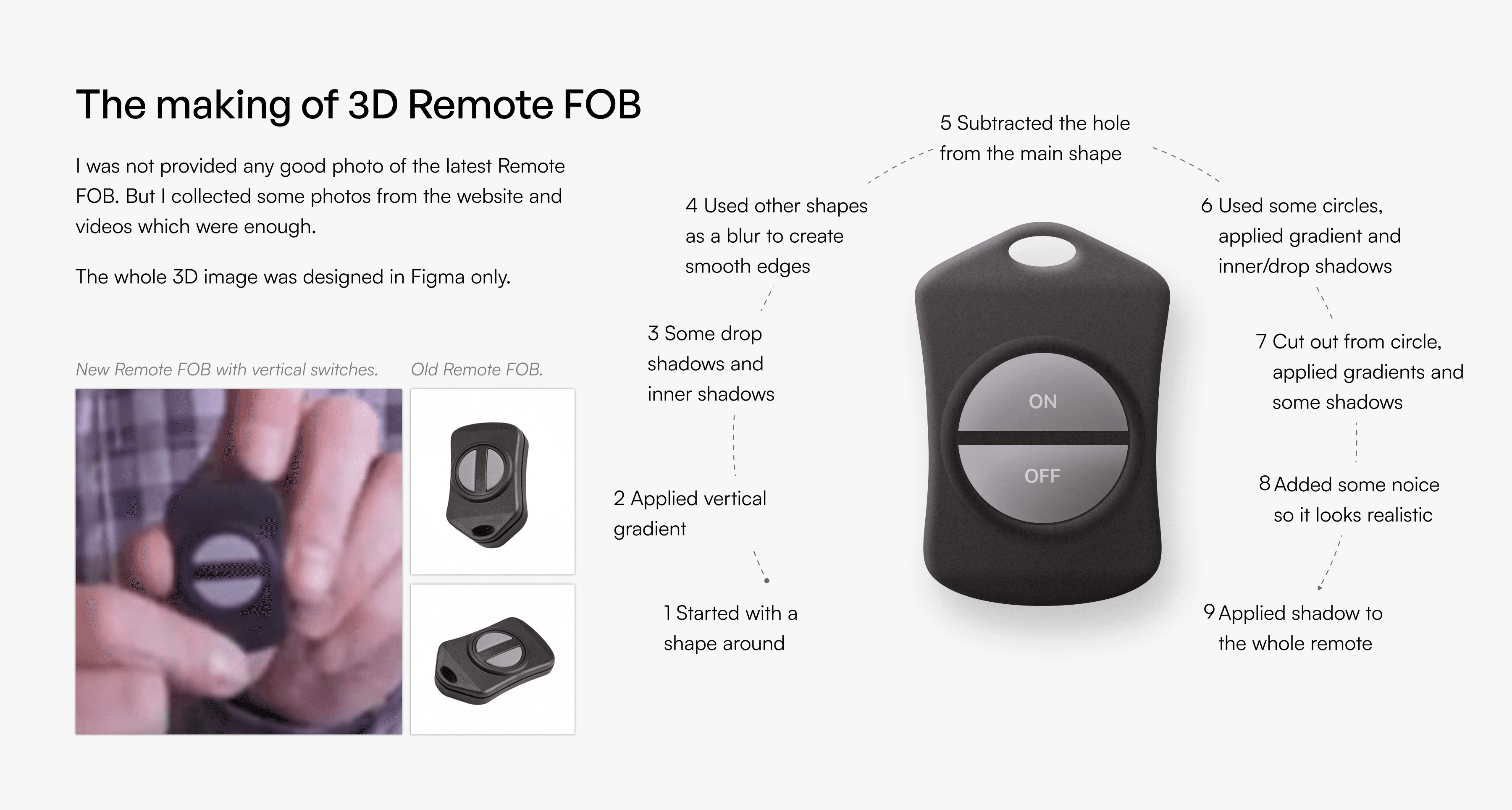
We explored multiple UI directions, including a simplified remote FOB layout and an interface with higher visual contrast and distinct system states. Each iteration focused on reducing cognitive load and increasing response speed.
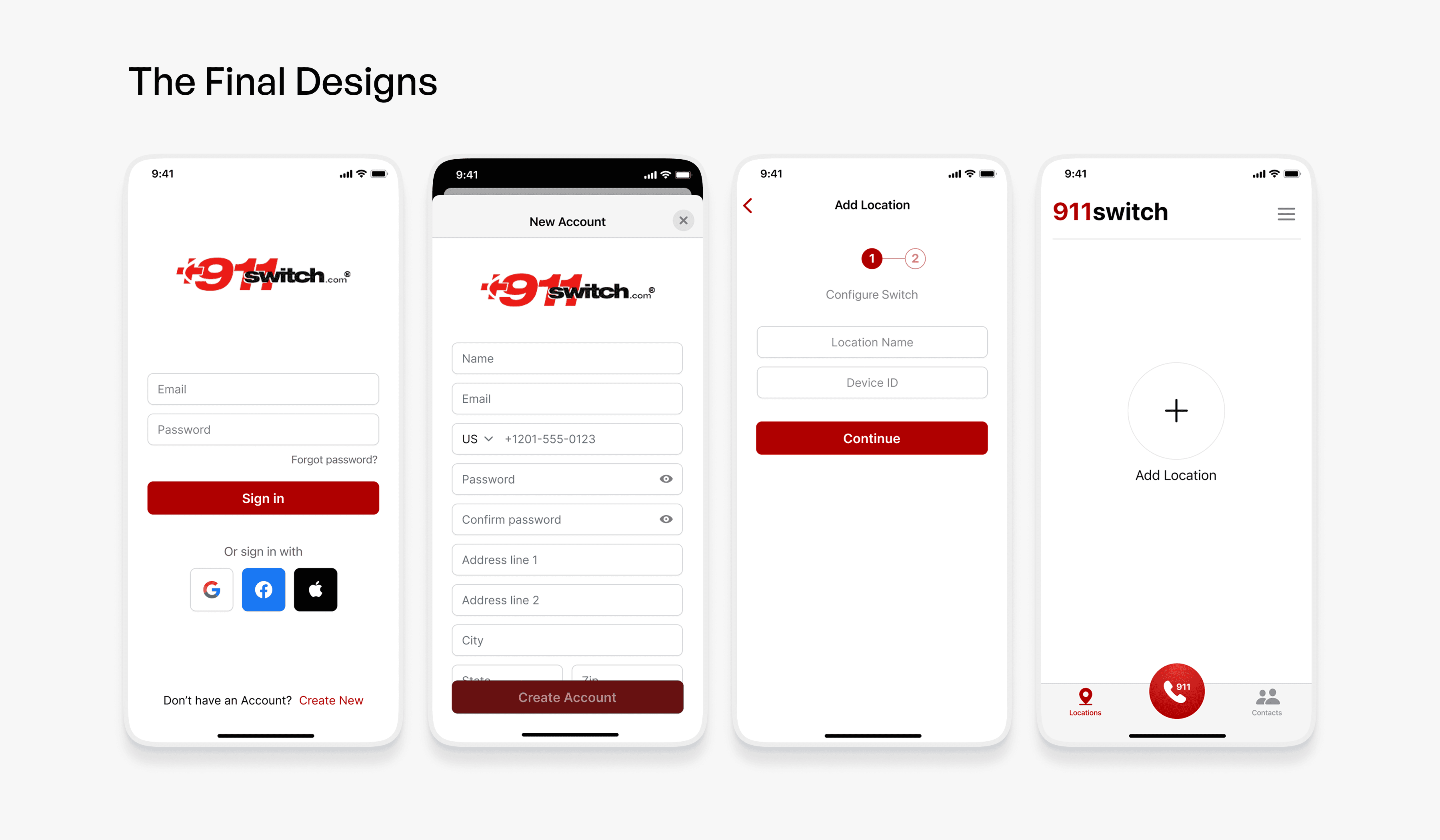
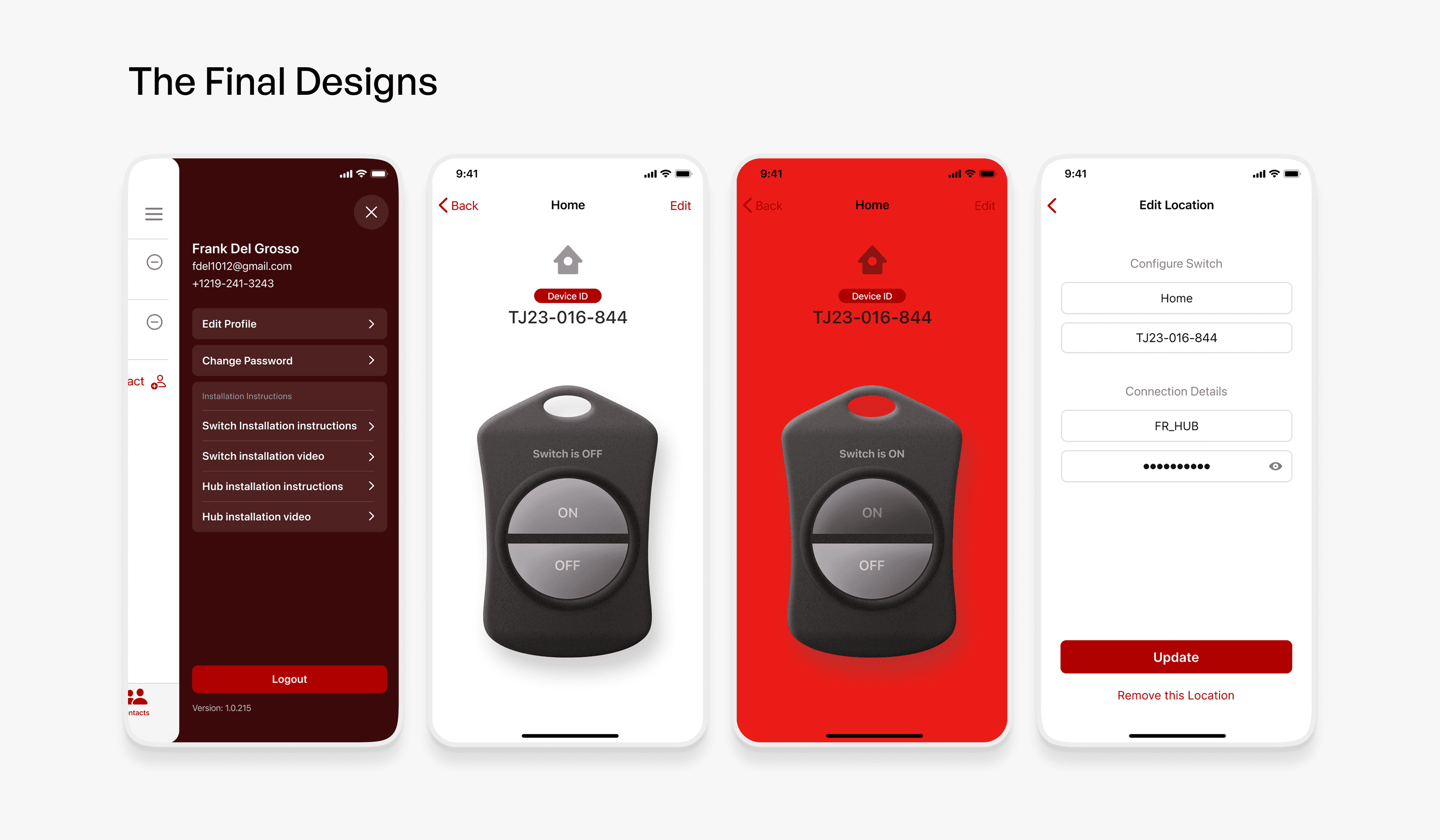
The final design is focused, human, and purposeful. It prioritizes clarity over complexity and brings confidence to a system that needs to work when every second matters.
1 / 2
Outcome
Trust, restored to the interface
The redesigned 911Switch app improved clarity, seriousness, and usability for emergency conditions.
- Users now experience improved readability and guidance
- Visual hierarchy supports quick decision-making
- Professional design strengthened trust in the system
- The client approved the chosen direction instantly
- The overall experience now aligns with the life-critical nature of the product
Next step
Have a build like this in mind?
Tell us what you're building, or what's slowing you down. We'll reply with an honest take on scope, approach, and whether AI belongs in it at all.
Fixed price, milestone-based. Milestones accepted on deliverables, not dates.