Qwoach
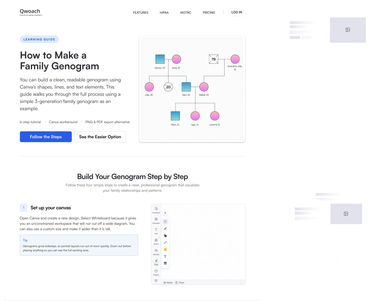
A layout system that lets Qwoach's AI build each blog page around its content.
19 section types and 49 layouts in one visual language, so Qwoach's AI can assemble each article from structures that fit its content.
Services
- Content Audit
- User Interface Design
- Design System
- Design Exploration
- AI Experience Strategy
Deliverables
- Blog Layout System
Domain
- Mental Health Practice Software
Brief
Where this started
Qwoach is software for therapists and counselors to record and organize notes on their clients, with practice tools such as genogram creation built in. Buzzinga Co. designed the original Qwoach application, and has been building components for the product since then, so this project started with a team that already knew the software from the inside.
Qwoach had a growing library of blog articles, with more content continuing to be added.
Designing every article individually wasn't practical, and one fixed blog template would flatten the differences between them.
The goal was not to design each finished blog page by hand. Buzzinga Co. set out to build a flexible layout system that could give Qwoach's planned AI workflow enough approved options to build each page around its actual content.
“Buzzinga did a great job updating our SaaS interface. They deep dived into the software to understand it first, which gave them great insight. As a result, they built tailored wireframes that were always on point. Recommended 100%!”
Challenge
Numerous articles, without numerous designs
Every article could contain a different mix of information. Some needed detailed comparisons, while others relied on step-by-step guidance, examples, statistics, definitions, imagery, FAQs, resources, or key takeaways.
A single template could make publishing easier, but it would also make every page follow the same visual rhythm. Designing every article independently would solve the variety problem, but wouldn't scale.
The system needed to balance three things:
- Consistency: every article should still feel recognizably Qwoach.
- Flexibility: different content should be presented in the way that suits it best.
- Scalability: new articles shouldn't require a new design process every time.
Discovery
We stopped thinking in pages
We started with a content audit rather than a blank page: instead of beginning with complete blog templates, we read through the existing articles and looked for the recurring types of information that appeared across them.
Patterns began to emerge: heroes, image-and-content sections, comparisons, steps, statistics, examples, FAQs, callouts, resources, CTAs, and other repeatable content structures.
But identifying the sections was only part of the problem. The same type of content could require a different presentation depending on its context. A comparison might work best as two opposing columns in one article, while another might need a detailed table. A content section might need a strong supporting image in one place and a compact editorial layout somewhere else.
That changed the direction of the project.
Instead of designing pages, we started designing choices.
1 / 3
Approach
One purpose, multiple layouts
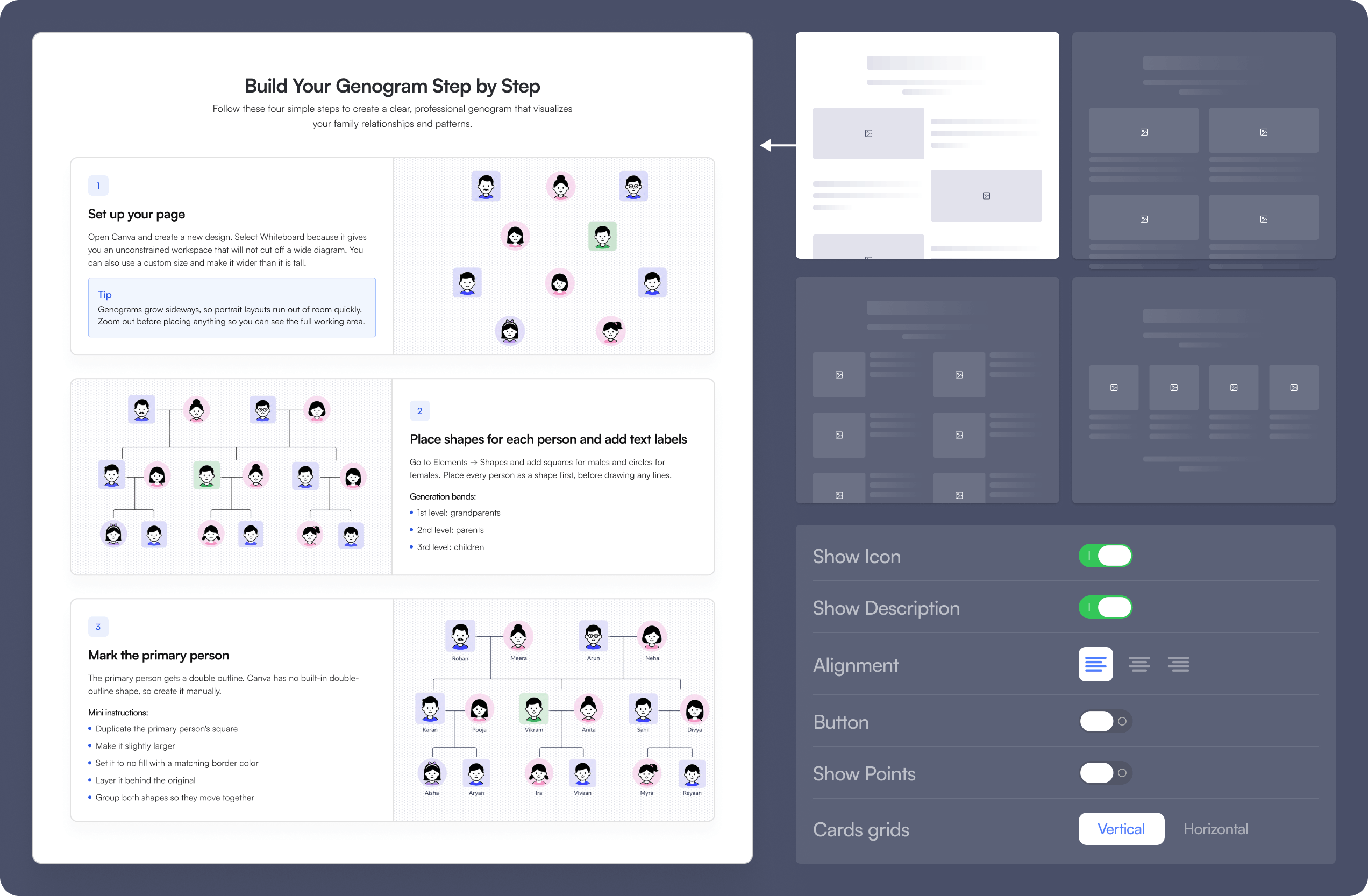
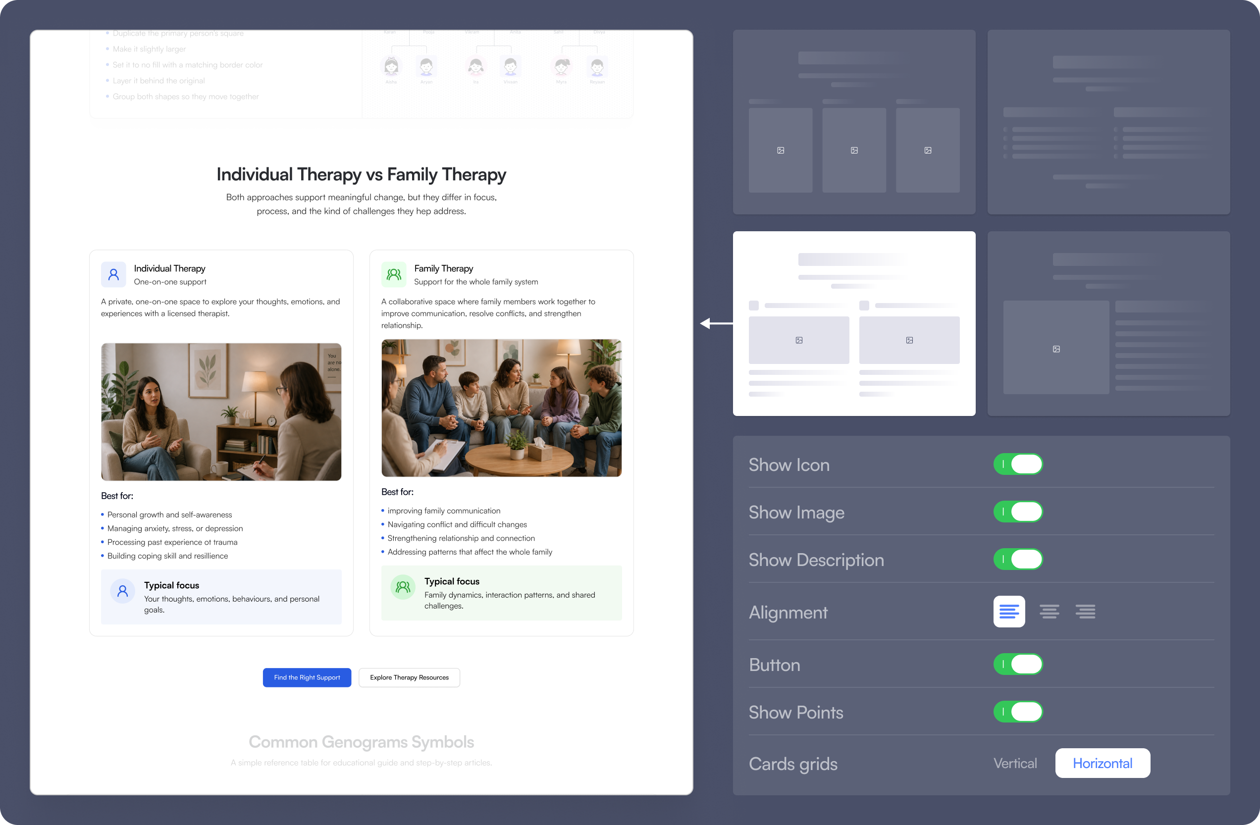
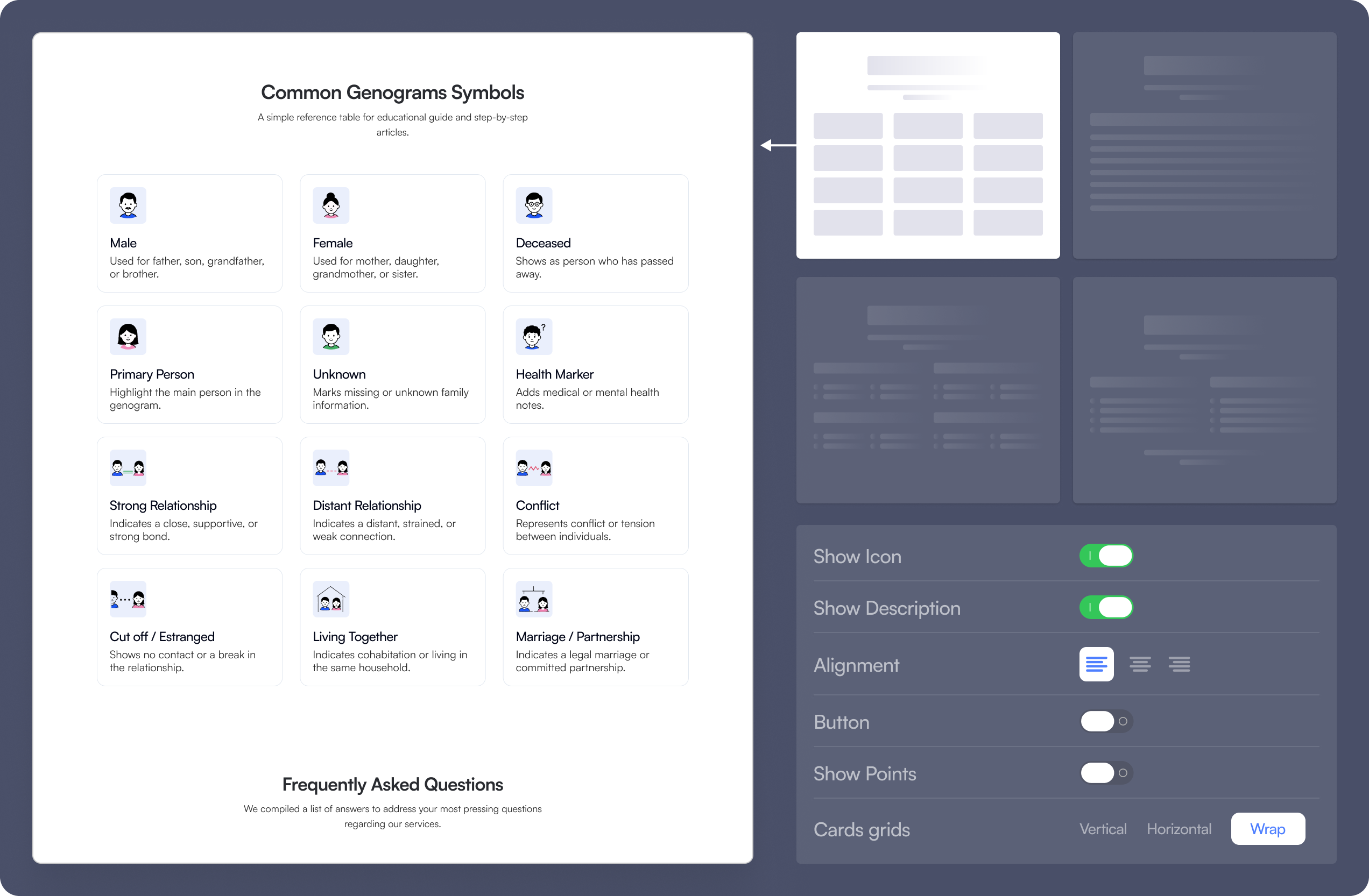
For each recurring section type, we designed as many structurally different layouts as its content actually needed, rather than one reusable component. Most ended up with two or more; a few kept a single layout, because that content only ever takes one shape.
A hero, for example, could be text-led, image-led, centered, split into two columns, or built around a stronger visual moment, and the same thinking ran through the rest of the library.
These aren't cosmetic alternatives. Each layout changes the hierarchy, composition, image placement, content density, or visual emphasis to suit a different content situation.
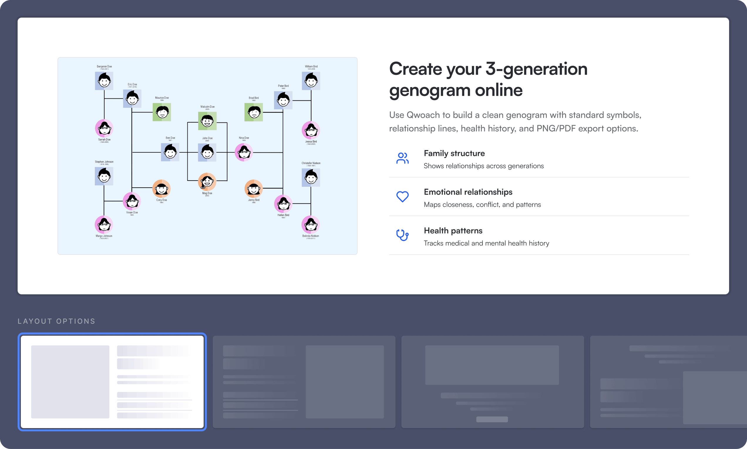
The 19 section types, and the 49 layouts designed across them:
Hero
2 layouts
Cards
2 layouts
Image and content
2 layouts
Comparison cards
2 layouts
Stats
2 layouts
Genogram
1 layout
Step-by-step
6 layouts
Checklist
3 layouts
FAQ
4 layouts
Related articles
4 layouts
Template gallery
2 layouts
Symbols
4 layouts
CTA
4 layouts
Devices
2 layouts
Before and after
2 layouts
Information
2 layouts
Text
2 layouts
Source
1 layout
Callout
2 layouts
Design
We designed the options. Their AI makes the selection.
At handover, Qwoach's AI workflow was planned rather than live, and the library was designed around it. Instead of generating a blog page from an empty canvas, the workflow chooses from layouts that have already been designed and approved.
Each part of an article maps to a section type, and a variant is picked to suit it. One article can open with a visual introduction, move into an image-led explanation, compare two options side by side, break a process into steps, and close with a CTA. Another can lead with an editorial opening, then statistics, FAQs, and related resources.
Variety only works if the options still feel connected. Typography, spacing, styling, and behavior stay consistent across the library, so layouts that differ structurally can sit on the same page without the experience feeling assembled from unrelated pieces.
Outcome
Delivered as a system, not as pages
What we handed over is not a set of finished blog pages. It is a reusable layout library: 49 layouts across 19 recurring section types in Qwoach's articles, with more than one layout wherever the content can take more than one shape, all in one visual language.
The library is what their AI workflow draws from when it assembles a page.
Instead of designing each new blog page one by one, we designed the system that can create them.
Next step
Have a build like this in mind?
Tell us what you're building, or what's slowing you down. We'll reply with an honest take on scope, approach, and whether AI belongs in it at all.
Fixed price, milestone-based. Milestones accepted on deliverables, not dates.